
PicFit uses image recognition to instantly find similar, budget-friendly clothing with direct links and saved lists, making stylish shopping simple.


How can we create a tool that lets users search for fashion visually, delivering accurate and affordable alternatives without the typical hassle of manual searching?


Detailed Phases!
Explore
Our team had a vague idea of what we wanted this app to accomplish, but it was necessary to narrow down our thoughts and focus on the details that really mattered.
We had some key questions that we focused on in this phase:
- What features are other current apps lacking that we want ours to contain?
- How can we make our app stand out from current fashion-searching resources and methods?
- How can we streamline the overall process of finding stylish and affordable clothing items?
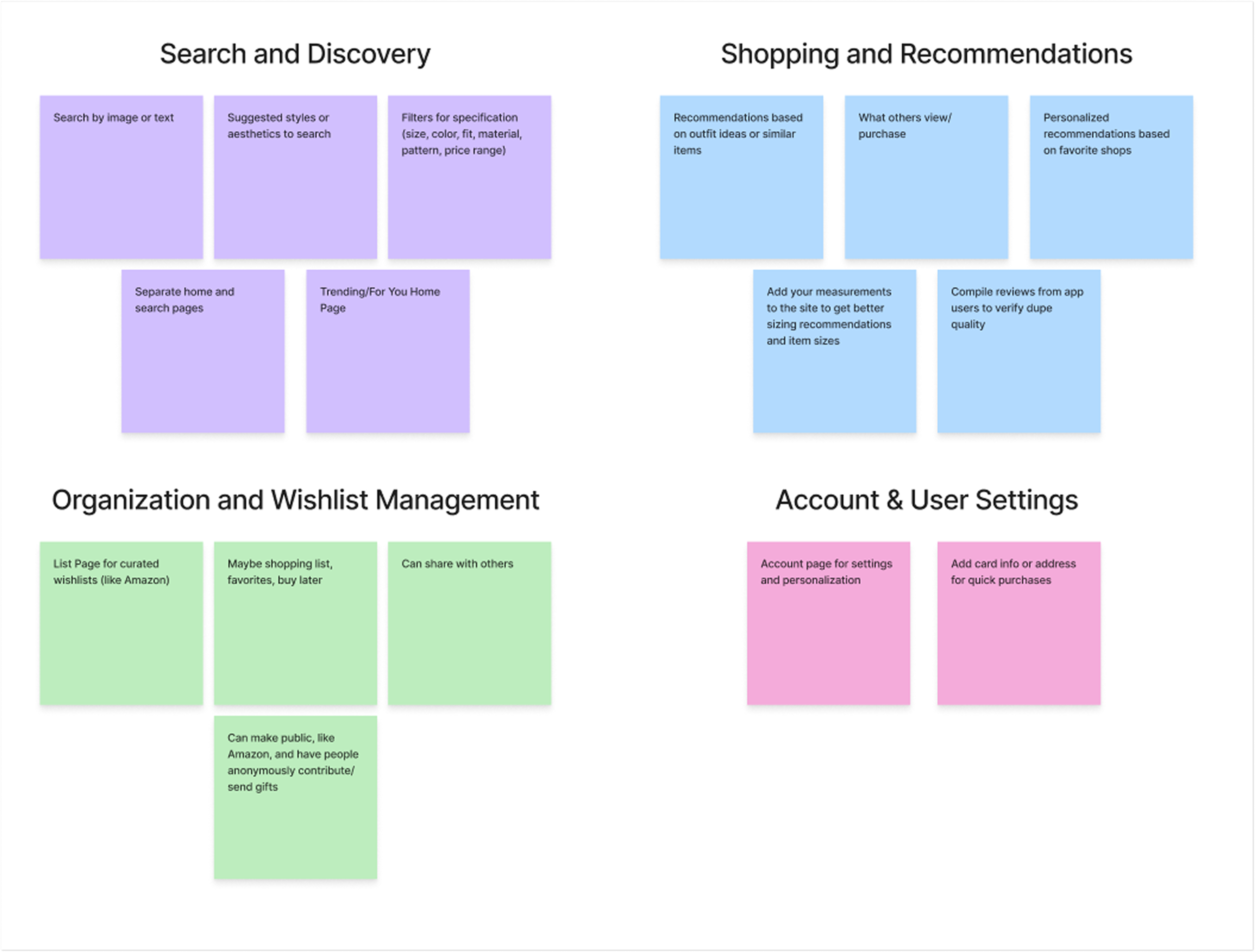
Affinity Diagram
Our first step was to brainstorm and compile our initial conceptual ideas for this application. Then, I organized our ideas using an Affinity Diagram, shown here.
I then ran a competitive business analysis to compare PicFit to competitors like Google Lens, Pinterest, Lyst, ASOS and Depop. In the analysis, I compared what we deemed vital to our app concept. Our main goal was to see what set our idea apart from currently offered tools and platforms.
Comparative Analysis
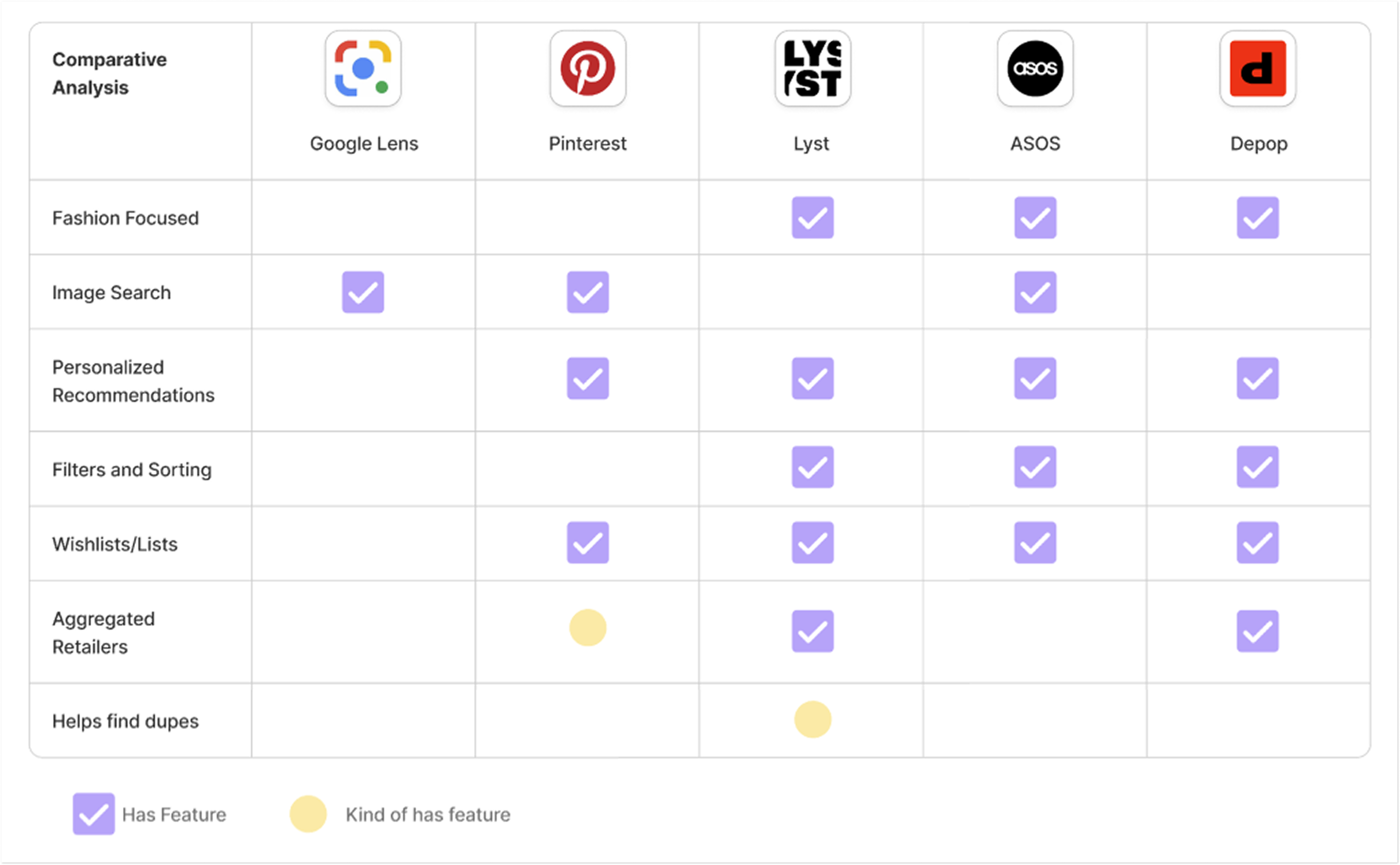
Main Findings:
While many sites offered some components of the application we aimed to create, none of them checked all of the boxes. Our idea had a clear opportunity to fill a current gap in the market.
Define
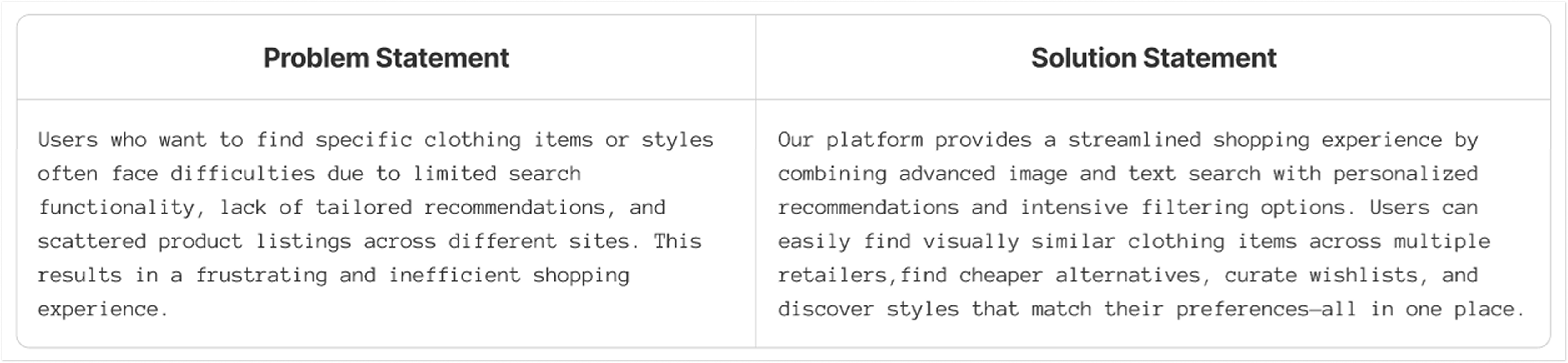
After the Exploration phase, we defined the problem and refined our solution. We clarified our goals with problem/solution statements and prioritized features using an impact-effort matrix.
Our developed problem and solution statements, keeping a focus on current user pain points:
With a clear product direction, we mapped features from our affinity diagram onto an Impact-Effort Matrix to prioritize the most valuable and feasible ones. These selected features guided my design decisions, balancing impact and implementation effort.
Impact-Effort Matrix
Main Findings:
By defining the problem and solution and evaluating features with an Impact-Effort Matrix, we created a clear roadmap that aligned our design decisions with user needs and feasibility.
Ideate
With clear product goals in mind, we entered the Ideate phase—using journey maps and early sketches to explore interactions and refine the app's structure before higher-fidelity designs.
From our findings in the Define Phase, we shifted our focus onto implementing these key features:
- Search by Image or Text
- Trending/For You Home Page
- Image Recognition for dupe
- Suggested Searches
- Filter Searches/Suggested
- Account Management Page
- Wishlist/List Creation
- Sharing lists and content with friends/peers
User Flow Diagram
With these features in mind, we developed a User Flow Diagram to outline the steps a user takes throughout the app. This final diagram helped guide our future sketches.
If you'd like to view the detailed steps, you can check it out
here!
Our Ideation Phase ended with the software team creating sketches to explore potential directions for the app's look and branding. The goal was to collaborate openly and establish a visual style that aligned with the app's vision while incorporating the team’s perspectives.
Software Team’s Sketches
Main Findings:
By completing a User Flow Diagram and developing some basic sketches, we were able to refine our direction for future wireframing and the ultimate design/style of the app and branding.
Design
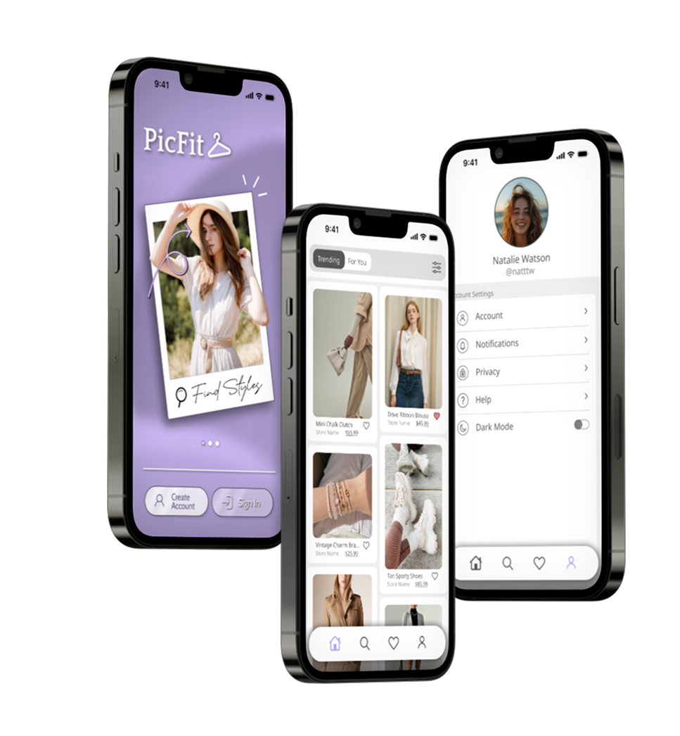
After several rounds of ideation, I arrived at a final design that fully captured the software team's ideas and feedback. Below are some key screens, each annotated for clarity.
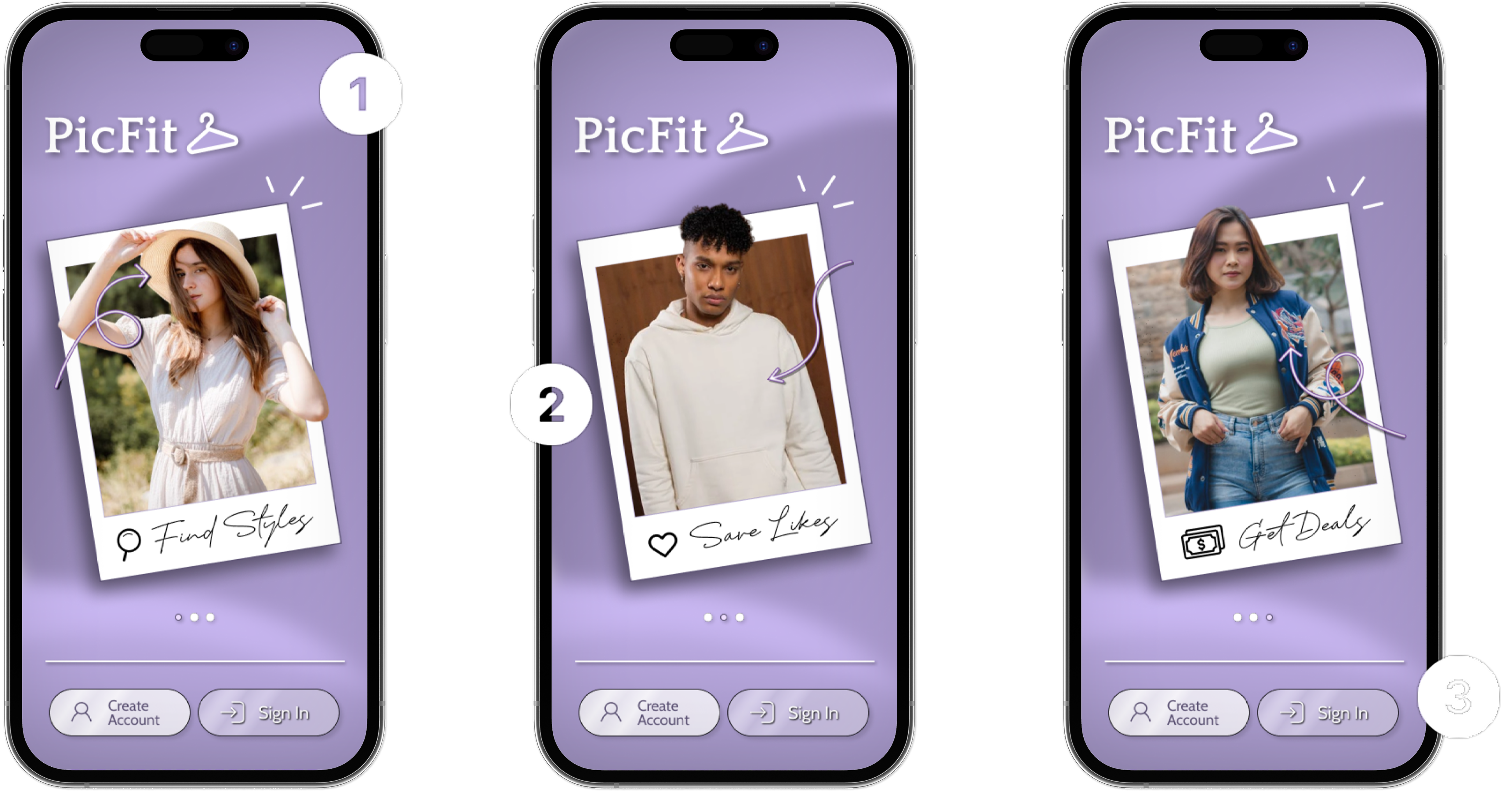
Onboarding

Color Palette of original branding design

Carousel with related images using Polaroid branding concept
Create Account & Sign Up options for new and old users
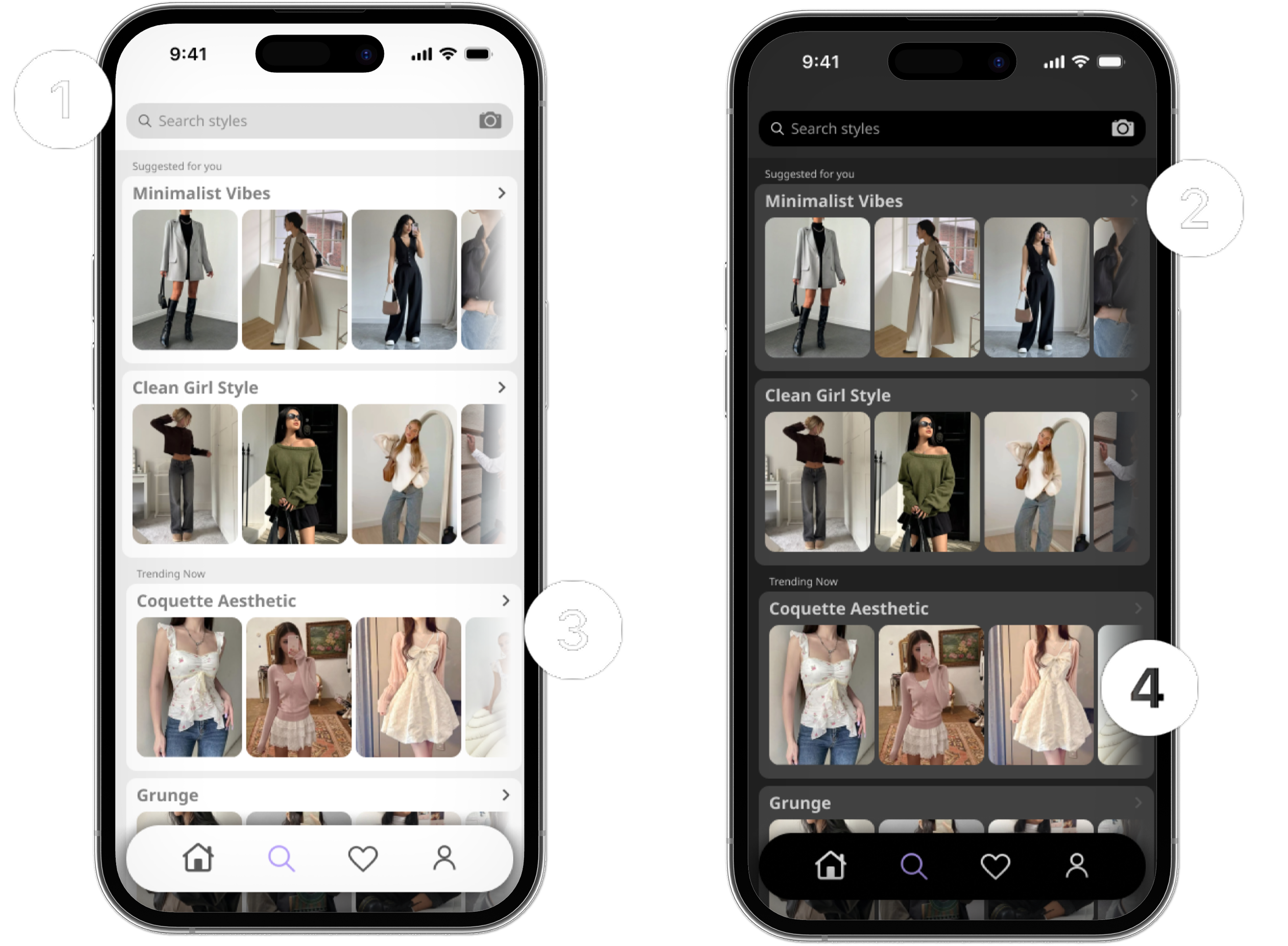
Search Page
Search by text or image
Suggested searches generated by account history
Trending searches listed for quick access
Simple, minimal layout to prioritize the image result
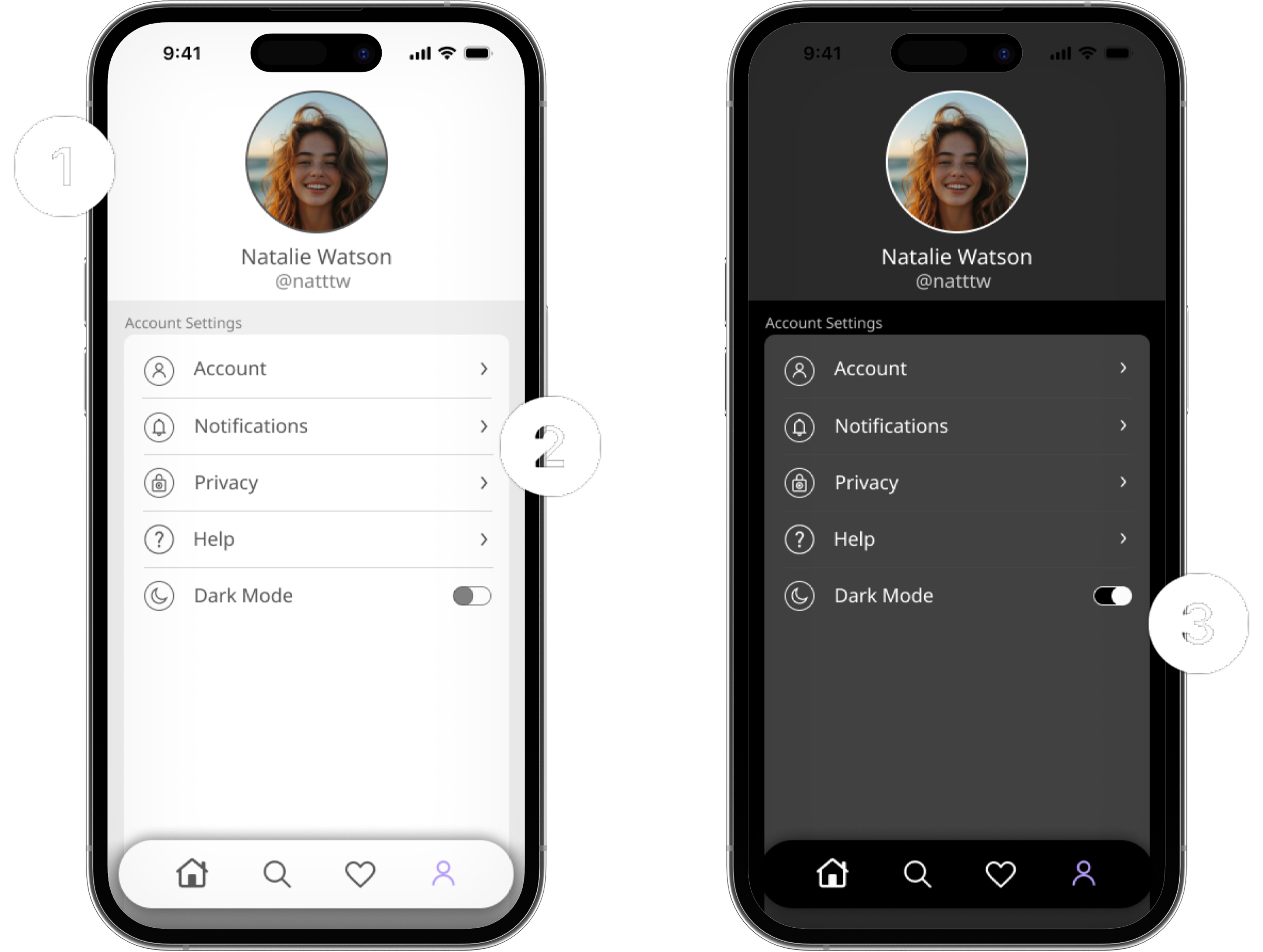
Account Page
User’s profile with unique photo and username
Typical user settings for account management
Toggle to enable/disable dark mode feature
Testing
Once our wireframes were ready, we wanted to validate our design by testing it with users. I conducted usability tests with several individuals to observe how they interacted with the app, then gathered feedback and used it to refine and improve our wireframes.
My Final Prototype!
Project Figma File